0 VotesYear: 2020|Entry Categories: Interior Architecture
Jeffrey Atlanta
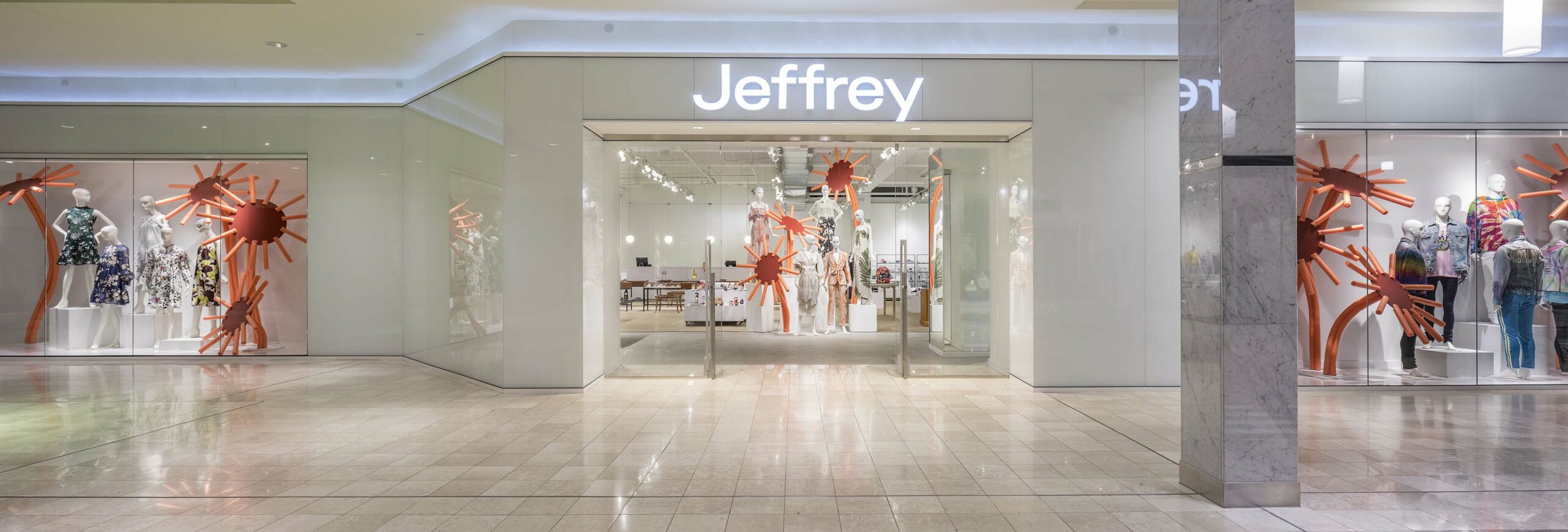
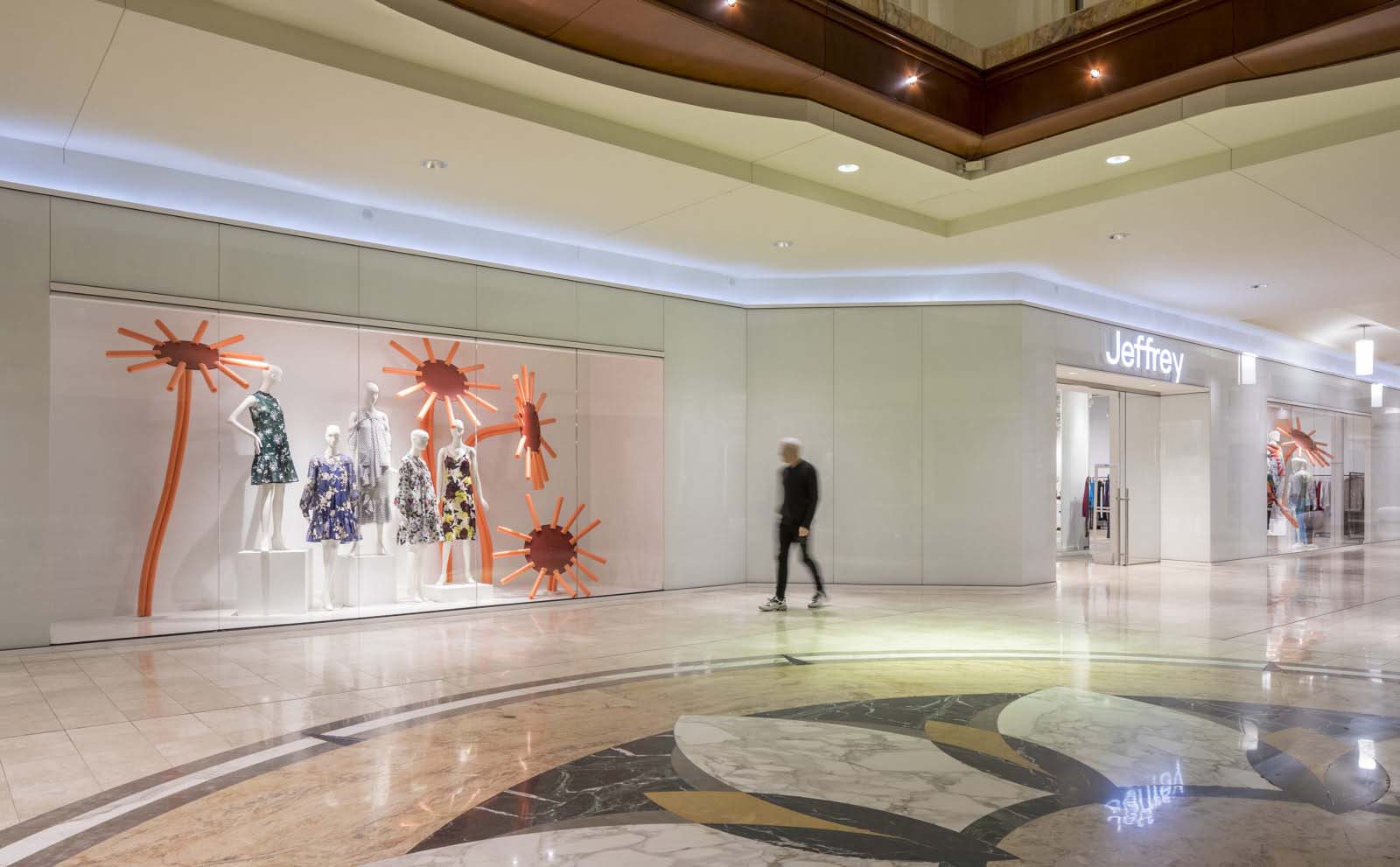
The Jeffery Atlanta boutique at Phipps Plaza was expanded to provide a more comprehensive collection for men. The new, expanded storefront is a clean, white modern design that is predominantly full-height, white glass panels set on a 4’-0” module. The design direction was in stark contrast to the mall’s traditional décor of mahogany walls and marble floors and the design team had to get several variances from mall management to execute the client’s vision of a clean, modern design aesthetic. The new design matches the boutique’s branded environment which is described as “a very visually pleasing white environment where the merchandise is king”.
Design Challenge
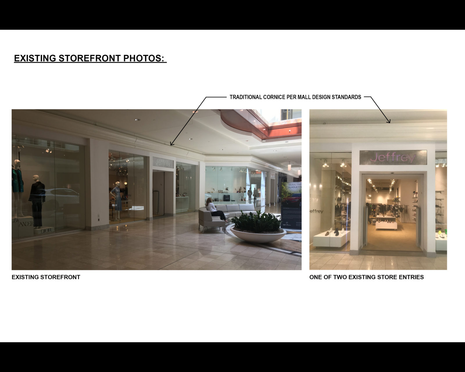
Opened in 1990 in Phipps Plaza, this luxury retail boutique’s flagship location was comprised of adjacent store spaces that were merged with minimal effort, which was especially evident in the existing storefront. The store had two separate entries, which added to security concerns and created challenges for the staff in managing the client experience. By acquiring the adjacent retail space, Jeffrey had an opportunity to create a new, cohesive storefront design with an expanded retail sales floor that better matched the boutique’s brand identity, and supported the personalized, luxury shopping experience their customers had come to expect.
Working with a minimal renovation budget, the team was tasked to: Integrate an additional 1,200 square feet to better serve their male clientele; Improve visual security throughout the sales floor area; Increase sales floor square feet where possible; Provide an overall organizational framework for the constantly changing mobile merchandise displays and furniture; and create a cohesive store design – both for the new, 124-foot long storefront and the expanded sales floor – that was more evocative of the brand’s aesthetic that has been described as “a Jetsons meets art gallery” backdrop of clean, white modernism.
On the interior, the additional space became the enlarged mens retail area with an upgraded dressing room. Moving the back wall of the cash wrap back into an underutilized storage area added valuable retail floor space and created a better visual connectivity across the newly enlarged sales floor to improve visual security. New custom rugs sit on exposed concrete and serve as an organizing framework for the mobile merchandise displays.Physical Context
A champion of avant-garde fashion, the boutique’s brand focuses on providing impeccable service and exciting products in a fun, positive, and upbeat environment. The design direction for both the storefront and sales floor was described by the boutique’s founder as “a very visually pleasing white environment where the merchandise is king”.
The design direction was in stark contrast to the mall’s traditional décor of mahogany walls and marble floors. The design team leveraged the fact that the new 124-foot long storefront would span nearly the entire length of one wing in the mall and requested design variances from the mall’s design standards. The team received approval for several variances with the most notable being the elimination of the heavy, articulated cornice located above the storefront which encircled the entire mall. In the end, the variances allowed the team to execute the client’s vision of a clean, modern design aesthetic.
The new storefront is a clean, white modern design that is predominantly full-height, white glass panels set on a 4’-0” module. Challenged with a limited budget, the team worked with standard ½” glass sizes to maximize the size of the panels and utilized simple installation techniques to create the clean, frameless façade. By eliminating the cornice, the glass panels are able to rise higher than the other stores in the mall, creating a crisp, clean edge at the ceiling that is highlighted by hidden cove lighting. Two new window displays and a single, double-sliding glass door entry are “punched” through the wall of white glass, focusing the visitor’s attention to the colorful merchandise on display in each opening.
Share This, Choose Your Platform!


